
The product:
A ceremony preview website for the trendy wedding venue Corte Grande. It allows users to select a date for the wedding, choose among venue locations, and view the restaurant menu.

Project duration:
February 2023 to March 2023.

The problem:
Couples who want to get married are often insecure about where to
organize the ceremony, and would also like to speed up the booking process.

The Goal:
Design a website that shows the potential of Corte Grande as a trending wedding location and helps couples who want to get married to choose and book the perfect location.

My role:
UX designer designing a website for Corte Grande from conception to delivery.

Responsibilities:
Conducting interviews, paper and digital wireframing, low and
high-fidelity prototyping, conducting usability studies, accounting for accessibility, and
iterating on designs.
User research: summary
I conducted user interviews and created empathy maps to understand the users I was designing for and their needs. A primary user group identifies adults who are going to organize their wedding ceremony and want to find an elegant and sophisticated location. Other choice factors are the absence of architectural barriers and the attention to the origin of the food, either for quality or for sustainability.
User research: pain points

Search and choice
For organizing such an important day users are afraid not to be able to choose the most elegant place.

Accessibility
The venue must be accessible to large groups and people with disability (wheelchairs).

Poor eyesight
The website should be accessible to people with color blindness problems.
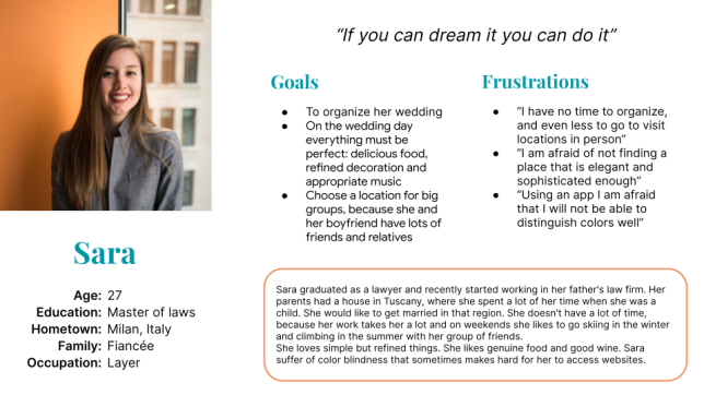
Persona: Sara
Sara is a young busy lawyer who’s going to get married and needs to find an elegant and well-organized place because she wants to have a sophisticated wedding day saving time in organization.
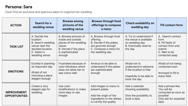
User journey map
Mapping Sara’s user journey revealed how helpful it would be for users to have access to a dedicated website to see and book the venue location.
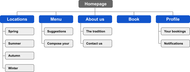
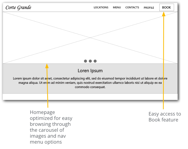
Site map
I choose a simple and direct navigation, to allow users to find any information immediately. I highlighted the book feature by putting it inside the main menu.
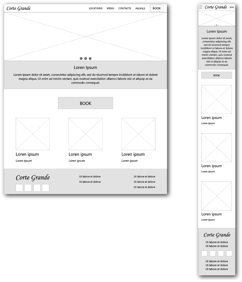
Digital wireframes
Moving from paper to digital wireframes made it easy to understand how the redesign could help address user pain points and improve the user experience. Prioritizing useful button locations (just like the Book button) was a key part of my strategy.
Screen size variation(s).
Low-fidelity prototype
To create a lo-fi prototype, I connected all menu items with the related pages. Then I followed the primary user flow related to the booking feature.
Usability study: parameters

Study type:
Unmoderated usability study.

Location
Italy, remote.

Participants:
5 participants.
Duration
20-30 minutes.
Usability study: findings
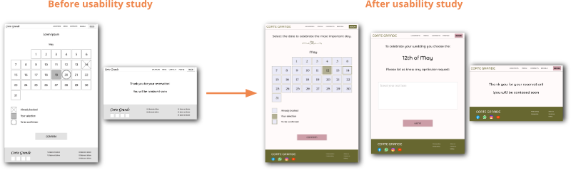
Users would like to be able to insert some notes before submitting the wedding date.
Users would like to have all the images for the locations displayed on a page (without carousel).
Users think that the images in the homepage boxes are confusing and useless.
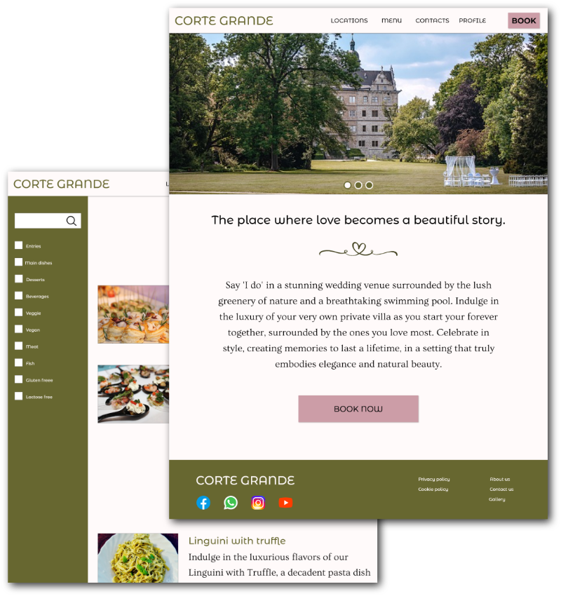
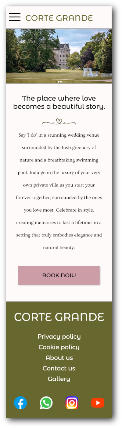
Mockups
Based on the insights from the usability study, I made a few design changes. One of the changes I made was the removal of the boxes from the home page to have a more organized and less distracting page.
Compared to wireframes, I added a form to fill in to add more information. The first one shows a hero image and a description. The second contains a gallery of images for the location.
Original screen size.
I included considerations for mobile screen size because users are likely to access the Corte Grande website from a variety of devices.
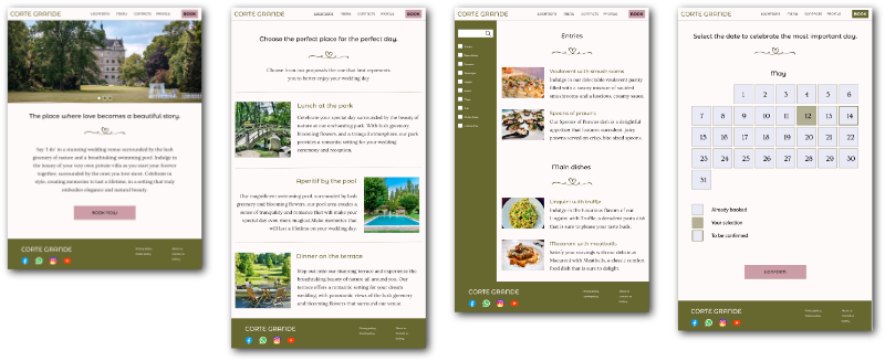
High-fidelity prototype
My hi-fi prototype followed the same user flow as the lo-fi prototype and included the design changes made after the usability study.
Accessibility considerations
Provided access to users who are vision impaired by adding alt text to images for screen readers.
Used icons as well text to help make navigation easier.
Checked font and colors against accessibility service sites.
Takeaways

Impact:
The website makes users booking process for Corte Grande venue quicker and smoother.
One feedback:
“It is unused, but extremely useful, to see availability in advance. So you don’t waste time.”

What I learned:
While designing the Corte Grande website, I learned that the first ideas are only the beginning of the process. Usability studies and peer feedback influenced each iteration of the website's designs.
Next steps
Conduct another round of usability studies to validate whether the pain points users experienced have been effectively addressed.
Conduct a new research study to verify the potential of a new functionality: the possibility to create a personalized menu for the wedding day online.
Conduct more user research to determine any new areas of need.
Thanks for reading!
If you have any feedback or would like to get in touch, please feel free to
contact me!


